A need to display the data from a CSV file very easily ? Here is how you can do it! It is easy and brings a nice look when it is use with plotly.
You can find the code here.
Create the first liens for streamlit
The first step is to design the widgets we want to have on our page:
def main():
    st.set_page_config(page_title="US jobs Dashboard",
                        layout="wide",
                        initial_sidebar_state="expanded")
    st.title("Welcome to dashboard")
    df = load_data("SofwareDeveloperIncomeExpensesperUSACity.csv")
    st.write(df)
    with st.sidebar:
        template_list =  ["plotly", "plotly_white", "plotly_dark", "ggplot2", "seaborn", "simple_white"]
        selected_template = st.selectbox('Select a plotly template', template_list)
        selected_x = st.selectbox('Select x to plot', df.columns.values)
        selected_y = st.selectbox('Select y to plot', df.columns.values)
    create_window(df, selected_x, selected_y, selected_template)
To define the main page and customized it, I used the set_pag_config function that helps me to add a title and to design how my page should look. Then, I used panda to read a CSV file and stored it in a data frame.
Now, I want to display my graph giving to the users the opportunity to choose the axes they want by using selectbox.
def create_window(df, x, y, template):
    st.subheader(f"{x} vs {y}")
    cs_bar = px.bar(df, x=x, y=y,template=template)
    st.plotly_chart(cs_bar, use_container_width=False)
This function will display my data frame according to the selected axes using bar graph.
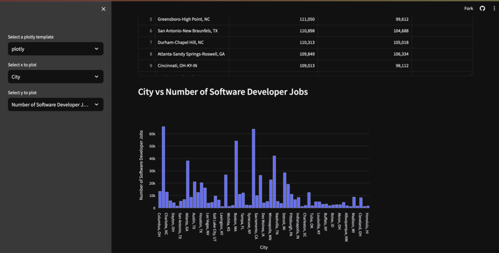
Here is the final result you can get :
Laisser un commentaire